deanston distillery
rebrand
Deanston Distillery underwent a rebrand which captured both the spirit of their community and the hard work and kinship of the generations before it.
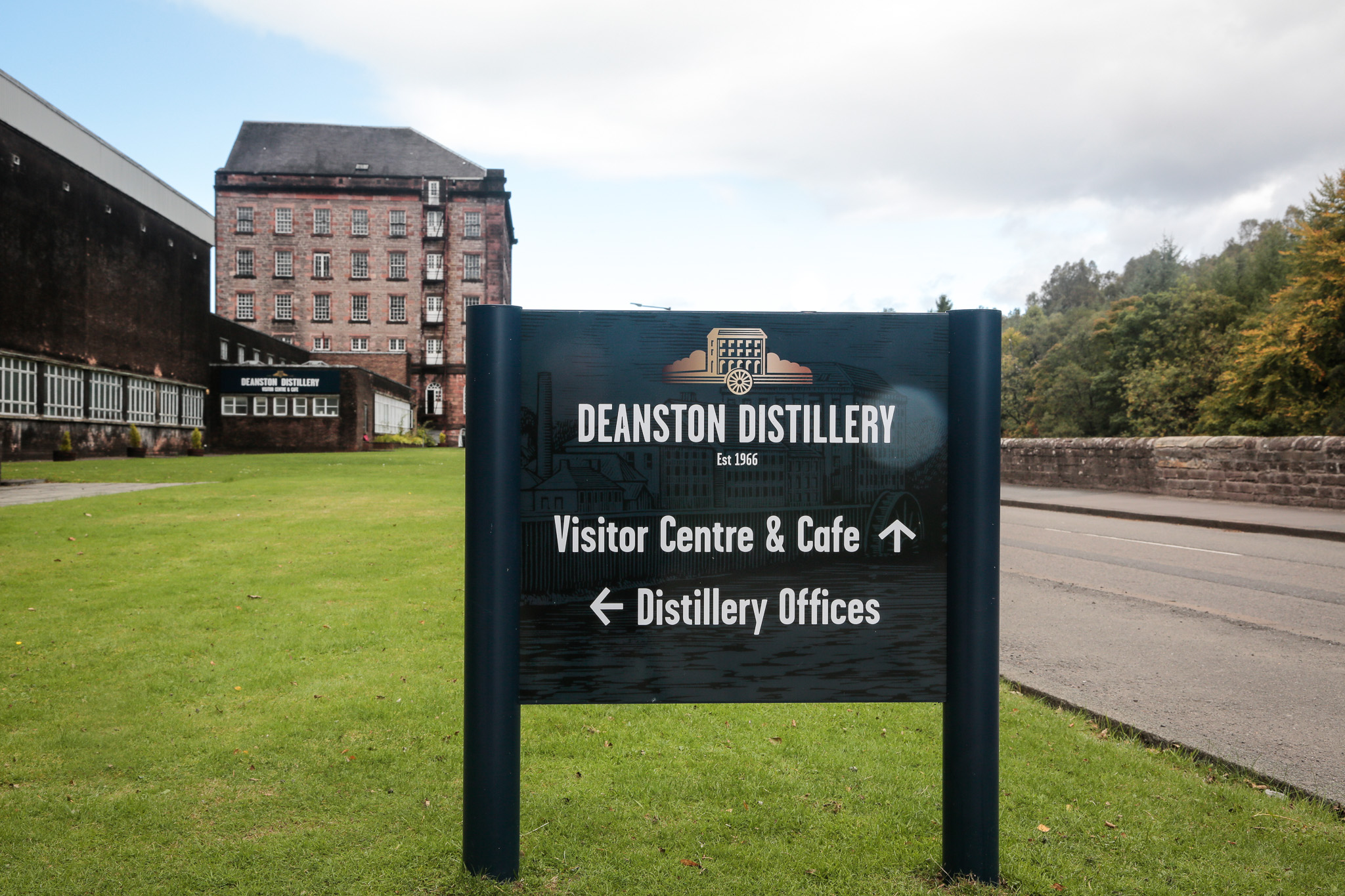
It was essential that the signage reflected the brand identity and the community and kinship in a light and positive manner.
brand fluidity
Deanston distillery used it’s Mill icon as the focus for the signage on this package. This was a simplified pictogram of the Deanston Mill, their home since 1966.
Our design team worked on the aesthetic elements of this project to present a variety of design options to the client for review. We determined the best use of materials, created an authentic design, and upheld the brand guidelines. The artwork we produced were based on designs provided by the Distillery Branding Team, utilising our knowledge and experience to advise on colours, fixings, content and sign locations.

unique products
As Consultants on this project, we undertook a full wayfinding survey and developed signage internally and externally for the visitor-facing areas of the Distillery. Our senior surveyor met with the Distillery team to carry out a site walk around, noting current sign locations, new locations and signage required for this project.
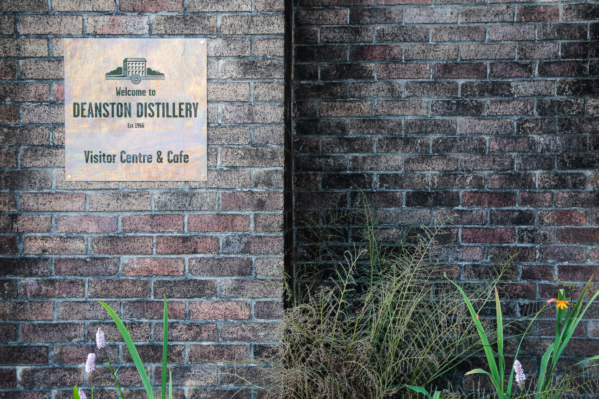
Our team worked with materials suppliers to ensure a perfect match to the specified copper tones which was key to the aesthetic of all signage. We utilised a highly specialised double engraving finishing technique to achieve the layers of text and graphics on the copper signage plaques for the bespoke visitor centre signage.

finding the way
Our work with the Distillery is one example of our close collaboration with branding teams to bring new branding and design concepts to life through prestigious, bespoke signage.
start your journey…
If you have a project you would like to discuss with us we’d love to hear from you.

