the importance of contrast in signage
Contrast is a fundamental design principle that plays a critical role in the effectiveness of signage. It refers to the visual differences between elements, typically in colour, size, shape, or font that help viewers distinguish one part of a sign from another. High contrast ensures legibility, enhances visibility, and ultimately contributes to the sign’s ability to communicate information quickly and clearly.
colour contrast
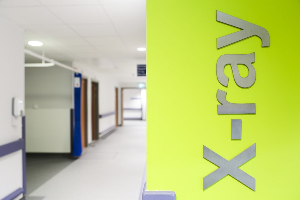
One of the most vital aspects of contrast in signage is distinctive colour. For instance, using a light-coloured font on a dark background, or vice versa, dramatically increases readability. Signs that lack sufficient differentiation between text and background, such as grey text on a white surface are difficult to read, especially from a distance or in poor lighting. This is particularly important for outdoor signs, highway signage, or in emergency situations where rapid comprehension is essential.
This also aids in drawing attention to key information. Bold fonts, larger sizes, or bright accent colours help guide the viewer’s eye to the most critical parts of the message. Without adequate difference, important details may go unnoticed, reducing the sign’s effectiveness. For example, a promotional sign in a store must immediately catch the eye and clearly convey discounts or offers something achievable only through strategic difference.
accessibility
Accessibility is directly impacted by contrast. Individuals with visual impairments, including colour blindness or low vision, depend on strong contrast to interpret signage correctly. Many accessibility guidelines, such as those outlined by the Disability Discrimination Act (DDA), specify minimum contrast ratios to ensure signs are usable by everyone.
Distinction in signage is not merely an aesthetic choice but a functional necessity in signage design. Effective use of contrast enhances readability, ensures accessibility, and maximizes the overall impact of a sign in delivering its intended message.
ready to discuss your project with our team?
We will work collaboratively with your project team to produce the best signage to meet your expectations and budget. Contact our team to discuss the signage requirements on your project.
